Data Visualization Techniques in Data Science
Data visualization is a cornerstone of data science, artificial intelligence (AI), machine learning (ML), and deep learning (DL). By transforming complex datasets into graphical representations, visualization makes it easier to understand patterns, trends, and insights. This blog will explore the key data visualization techniques, their applications, tools, and examples to help you leverage the power of visual storytelling.
Importance of Data Visualization
Data visualization plays a vital role in:
Understanding Data: Identifying patterns, anomalies, and distributions.
Communication: Conveying insights effectively to non-technical stakeholders.
Decision Making: Supporting data-driven strategies by revealing actionable insights.
Model Evaluation: Assessing the performance and interpretability of machine learning and deep learning models.
Useful Libraries first you install
					NumPy = !pip install numpy

Pandas = !pip install pandas

Matplotlib = !pip install matplotlib

Seaborn = !pip install seaborn

Plotly = !pip install plotly
Import Command
					import numpy as np
import pandas as pd
import matplotlib as plt
import seaborn as sns
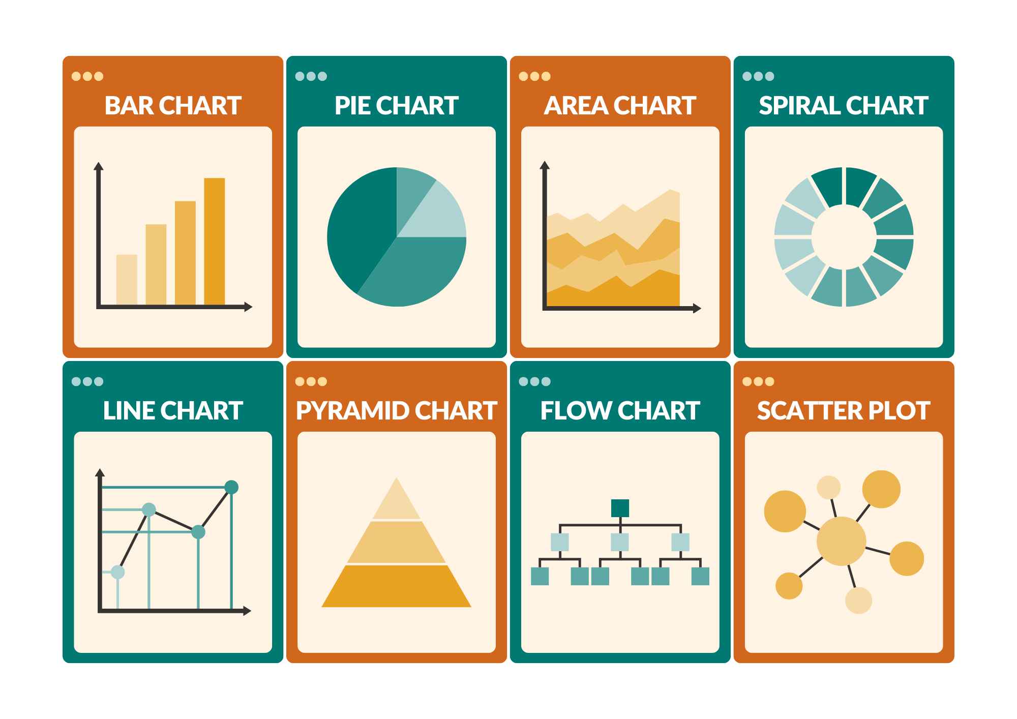
Common Data Visualization Techniques
1. Basic Charts
Line Charts: A graphical representation of data points connected by a straight line, used to show trends over time. Example: Tracking stock prices or website traffic.
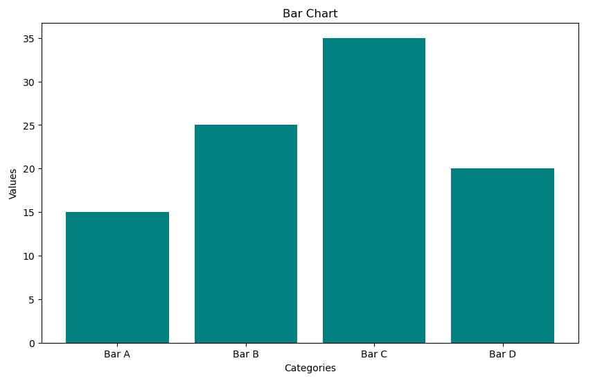
Bar Charts: A chart with rectangular bars representing categorical data values. Example: Comparing sales revenue across regions.
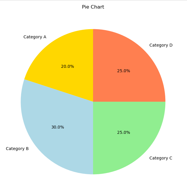
Pie Charts: A circular chart divided into slices to represent proportions. Example: Visualizing market share among competitors.
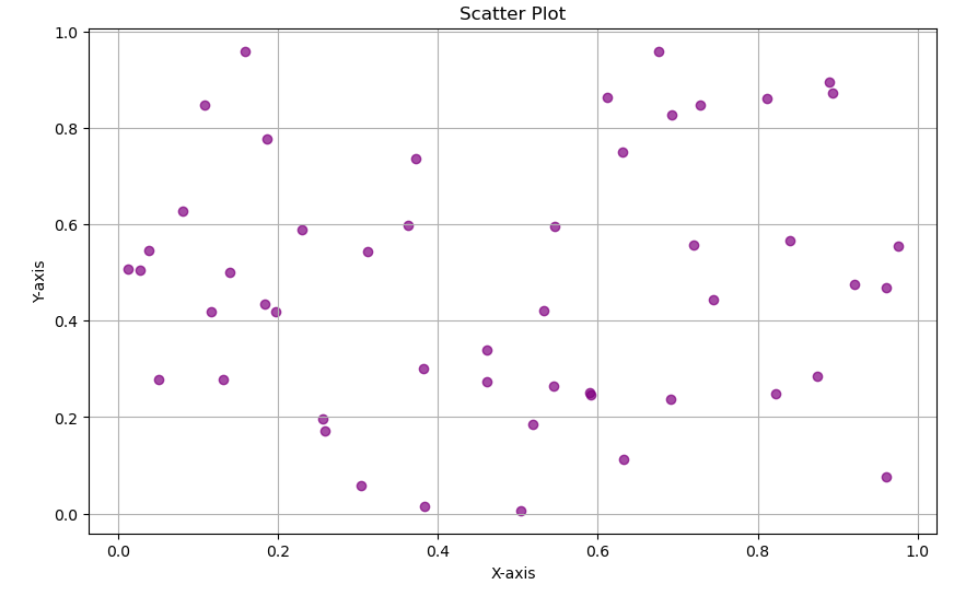
Scatter Plots: A graph with points plotted to show relationships between two variables. Example: Exploring feature-target relationships in regression analysis.
For Examples
					import matplotlib.pyplot as plt
import numpy as np

# Data for the charts
x = np.linspace(0, 10, 100)
y = np.sin(x)

categories = ['Category A', 'Category B', 'Category C', 'Category D']
values = [20, 30, 25, 25]

scatter_x = np.random.rand(50)
scatter_y = np.random.rand(50)
bar_categories = ['Bar A', 'Bar B', 'Bar C', 'Bar D']
bar_values = [15, 25, 35, 20]
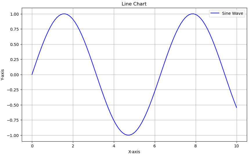
Line Chart
					plt.figure(figsize=(10, 6))
plt.plot(x, y, label='Sine Wave', color='blue')
plt.title('Line Chart')
plt.xlabel('X-axis')
plt.ylabel('Y-axis')
plt.legend()
plt.grid(True)
plt.show()
Output
Pie Chart
					plt.figure(figsize=(8, 8))
plt.pie(values, labels=categories, autopct='%1.1f%%', startangle=90, colors=['gold', 'lightblue', 'lightgreen', 'coral'])
plt.title('Pie Chart')
plt.show()
Output
Scatter Plot
					plt.figure(figsize=(10, 6))
plt.scatter(scatter_x, scatter_y, color='purple', alpha=0.7)
plt.title('Scatter Plot')
plt.xlabel('X-axis')
plt.ylabel('Y-axis')
plt.grid(True)
plt.show()
Output
Bar Chart
					plt.figure(figsize=(10, 6))
plt.bar(bar_categories, bar_values, color='teal')
plt.title('Bar Chart')
plt.xlabel('Categories')
plt.ylabel('Values')
plt.show()
Output
2. Advanced Charts
Heatmaps: A data visualization technique using color gradients to represent the magnitude of values. Example: Correlation matrices in feature analysis.
Box Plots: A graphical representation of a dataset’s distribution, highlighting medians, quartiles, and outliers. Example: Examining salary ranges in a company.
Histograms: A bar chart representing the frequency distribution of a numerical variable. Example: Analyzing age distributions.
Area Charts: Similar to line charts but filled with color below the line, emphasizing volume over time. Example: Displaying cumulative sales trends.
3. Geospatial Visualizations
Choropleth Maps: A map where regions are shaded based on a data variable. Example: Population density visualization.
Bubble Maps: A map displaying data points as bubbles of varying sizes to represent values. Example: COVID-19 case distribution.
Trajectory Plots: Graphs showing movement or flow patterns across a map. Example: Shipping route optimization.
4. Interactive Dashboards
Definition: Dashboards that allow users to interact with and explore data dynamically.
Example: Filtering sales performance data by region and time frame using Tableau.
5. Network Graphs
Definition: Graphs that depict relationships between entities as nodes and edges. Example: Social network analysis to identify influencers.
Data Visualization in Machine Learning
Visualization is crucial for:
Data Preprocessing:
Definition: Preparing raw data for analysis by identifying patterns and anomalies.
Example: Heatmaps to locate missing data or box plots to identify outliers.
Feature Engineering:
Definition: Creating new input features or selecting relevant ones to improve model performance.
Example: Correlation plots to highlight strong predictors.
Model Evaluation:
Definition: Assessing the performance of ML models.
Example: Using ROC curves to evaluate classifiers or residual plots for regression analysis.
Example Tools: Matplotlib, Seaborn, and Plotly.
Data Visualization in Deep Learning
Deep learning models often involve complex structures, making visualization essential for:
Understanding Model Architecture:
Definition: Representing the structure and flow of a neural network.
Example: Using TensorBoard to display layers and connections.
Feature Maps:
Definition: Visualizing intermediate outputs of neural networks to understand feature extraction.
Example: Heatmaps to analyze CNN activations.
Loss and Accuracy Trends:
Definition: Monitoring model training performance over time.
Example: Plotting loss and accuracy curves across epochs.
Example Tools: TensorBoard, PyTorch’s torchvision, and Keras visualization utilities.
Popular Data Visualization Tools
1. Matplotlib
Definition: A comprehensive library for creating static, animated, and interactive visualizations in Python.
Pros: Versatile and customizable.
Use Case: Creating static, publication-quality plots.
2. Seaborn
Definition: A Python library based on Matplotlib, offering high-level interfaces for drawing attractive statistical graphics.
Pros: Simplifies complex visualizations with beautiful themes.
Use Case: Correlation heatmaps, pair plots.
3. Plotly
Definition: A graphing library that supports interactive and web-based visualizations.
Pros: Interactive and web-based.
Use Case: Real-time dashboards.
4. Tableau
Definition: An enterprise-grade visualization platform for creating interactive dashboards and reports.
Pros: Enterprise-grade visualization platform.
Use Case: Business intelligence dashboards.
5. Power BI
Definition: A business analytics tool by Microsoft for creating reports and dashboards.
Pros: Seamless integration with Microsoft tools.
Use Case: Enterprise reporting.
6. ggplot2
Definition: A data visualization package in R based on the Grammar of Graphics.
Pros: Elegant graphics in R.
Use Case: Statistical visualizations.
Applications of Data Visualization
1. Healthcare
Definition: Using visual techniques to interpret medical data and trends.
Example: Visualizing patient data to predict disease outbreaks.
Tool Example: Power BI for hospital resource planning.
2. Finance
Definition: Analyzing financial data to identify trends, risks, and opportunities.
Example: Candlestick charts for stock trends or fraud detection with anomaly detection visualizations.
Tool Example: Tableau for financial forecasting.
3. Retail
Definition: Leveraging data visuals to optimize operations and marketing strategies.
Example: Heatmaps to analyze customer purchase behavior.
Tool Example: Plotly for inventory analysis.
4. Logistics
Definition: Visualizing data to streamline supply chains and delivery operations.
Example: Route optimization using trajectory plots.
Tool Example: Power BI for logistics tracking.
5. AI and ML
Definition: Interpreting the outputs and mechanisms of AI and ML models.
Example: Using SHAP and LIME visualizations to explain black-box models.
Tool Example: Matplotlib for decision boundary visualizations.
Best Practices for Effective Data Visualization
Know Your Audience: Tailor the level of complexity based on your audience.
Choose the Right Chart Type: Select visualizations that best represent your data and insights.
Simplify: Remove unnecessary elements to avoid clutter and focus on key messages.
Use Color Wisely: Choose appropriate and accessible color schemes.
Add Context: Use labels, annotations, and legends to ensure clarity.